Alice Mobile App MVP
Redefining User Experience of a Brand-New, Revamped App for Hoteliers
→ Role
Product Designer
→ Platform
Mobile
→ Year
2024 - 2025

About the product
ALICE is a comprehensive product that improves operational efficiency and communication within the hospitality industry, contributing to better productivity and higher guest satisfaction. The mobile app supports various departments, from Engineering to Housekeeping, ensuring guest requests are handled promptly and consistently. No reliance to radios, paper, pens, or physical contact.
High Level Business and User Goals
Achieve NPS ≥ 30 and App Store ratings of ≥ 4/5 stars.
Better support the urgent need for large-scale rollouts, such as Accor, Marriott, Highgate, and other major groups.
Design a first-class mobile app that sets a new standard in hotel operations, delivering a seamless, intuitive, and reliable experience for hotel staff.
Team
Product Manager: Kenya Puig
Product Owner: Mitchell McMillin
Engineers: Fernando Silva, AJ Montoya, Darren Nelsen, Anton Kosyakin
My Role
As Product Designer, I led the design process from conception to execution, collaborating closely with cross-functional teams, including product managers, engineers, and business units. Additionally, I received valuable and timely contributions from other product designers on our team—contributions for which I am deeply grateful.
Problem
Alice's mobile user base outpaced the desktop, creating a need for a high-performance app with a seamless user experience. Users on the go required a reliable, easy-to-use tool for task management.
Users key pain points included session timeouts, unreliable notifications, lack of offline functionality, and bad user experience. The app NPS was 8, lower than other Actabl products.
Design Outcome
Developing an MVP to address critical user pain points, such as unclear workflows, poor information hierarchy, and inconsistent UI elements, while setting the foundation for ongoing improvements based on user feedback.
Context
We used to received constant feedback about users' dissatisfaction with the app. Despite several attempts to maintain the legacy version and implement updates over time to fix issues and improve usability, these efforts were not effective. As a result, prioritizing the app redesign became a company goal, included in our OKRs.
User Feedback on old app
Segment Overview
Alice is a task management system, and the Service Delivery module allows users to receive and dispatch tickets to other departments. This module operates independently from the other features and tabs in the mobile app, making it a key focus for the MVP.
Other modules, such as Housekeeping, will be integrated into the app in V2.
Initial Design Steps
Heuristic Evaluation
We conducted a Heuristic Evaluation to identify key usability problems, assessing navigation, accessibility, consistency, error prevention, and user flow. This revealed critical issues, such as poor information hierarchy, inconsistent UI elements, unclear workflows, and lack of user feedback, all of which hindered task efficiency and user clarity, guiding prioritization for design improvements.
Old App User Flows
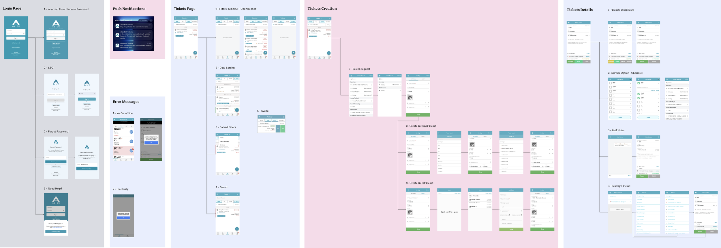
We mapped the user flows of the old app to get an overview of its structure and complexity. This allowed us to identify pain points, redundancies, and opportunities for simplification.
The activity was carried out in collaboration with key stakeholders, including other designers and the product manager.
Old App User Flow (Service Delivery only)
Definition of MVP Scope
The definition of the MVP scope was based not only on the direct identification of the app's core functionalities but also on an analysis of feature usage in Pendo. This allowed us to ensure that we prioritized flows and features important to users while de-prioritizing or even eliminating unused features, which should be rethought or removed before being included in the app.
Redesigned Flows
The ticket creation, ticket editing, and offline mode flows were redesigned, with the ticket edition flow undergoing a major review:
Problem: Users struggled to distinguish editable from non-editable fields on the ticket screen, leading to confusion and increased cognitive load.
Solution:
All fields are now editable with Edit permissions, and non-editable fields are placed in a separate section. Users must press save to update tickets.Outcome:
The flow is clearer and easier to use, validated by users who found it simpler to identify editable fields.
Old vs New Experience
Validation
Major flows were validated through qualitative testing, with both in-person and remote user sessions, as well as quantitative testing using the Maze tool. This process was crucial in confirming design decisions, ensuring that the redesigned flows aligned with user expectations.
Final UI Adjustments
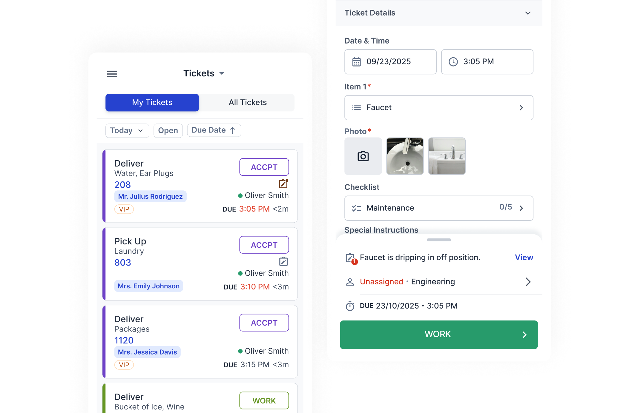
After completing the validation process for the main flows and using our design system, I finalized all the screens with consistency as a guiding principle. The design emphasizes simplicity, incorporating familiar UX/UI patterns commonly used in other applications.
Key elements, such as titles, form fields, and primary buttons, follow a clear visual hierarchy to guide users' attention. The final UI is scalable and adaptable to future features while maintaining a cohesive and user-friendly experience.
UX Metrics
In order to evaluate our impact, we developed a simple survey incorporating two questions based on the UMUX-Lite and CSAT methods, alongside one task-focused question tailored to the primary user flow. This survey was shared with current users of the old app.
The goal is to conduct the same survey with an equivalent user sample once the new app reaches General Availability (GA). This approach allows us to gauge not only the current user satisfaction but also to measure the results of the MVP and our contribution as designers.
Future Steps
Monitor and participating in the beta process.
Incorporate feedback from beta users.
Use UX metrics to assess design contributions post-GA.
Learnings
Balancing the need to maintain established flows versus avoiding abrupt changes to the experience, considering that some of our users are not tech-savvy.
Design critiques are essential for improving any design.
A lot of learning in defining UX/UI patterns for Actabl mobile apps.
I’m incredibly grateful for the opportunity to work on this project and the valuable lessons I've learned from the collaboration with our multidisciplinary team. Together, we've improved the product’s quality and enhanced its usability, making it more competitive in the market and contributing to the Actabl’s profitability.


